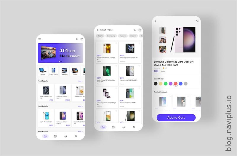
Why will Shopify web design (specially Shopify mobile design) determine the success of your sales?
The design of a Shopify website can significantly influence sales success because it directly impacts user experience. A well-designed website that understands its audience, provides easy navigation, and offers high-quality imagery and product descriptions can enhance customer engagement, thereby increasing conversions. Further, factors like fast loading speed, secure and straightforward checkout process, SEO friendliness, and consistent branding can help attract and retain customers, ultimately leading to higher sales.
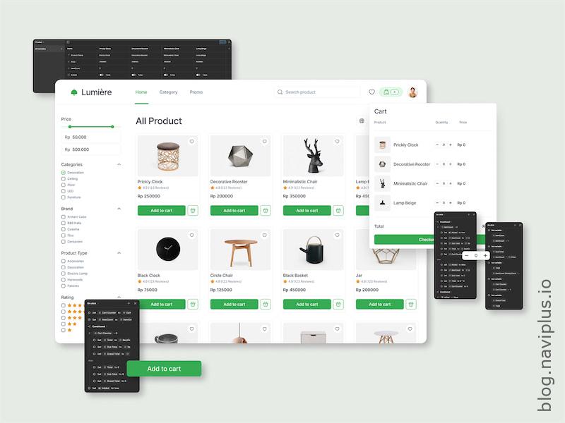
Designing a beautiful Shopify website is difficult, but you can totally do it.
Indeed, designing a beautiful and effective Shopify website might seem challenging at first. It requires a blend of creativity, technical skills, and a deep understanding of your audience’s needs. However, with the right approach, tools, and a willingness to learn and adapt, you can create a Shopify website that not only looks stunning but also drives sales and contributes significantly to your business’s success. Remember, the key lies in creating a user-friendly design that aligns with your brand, offers a seamless shopping experience, and ultimately encourages visitors to make a purchase.
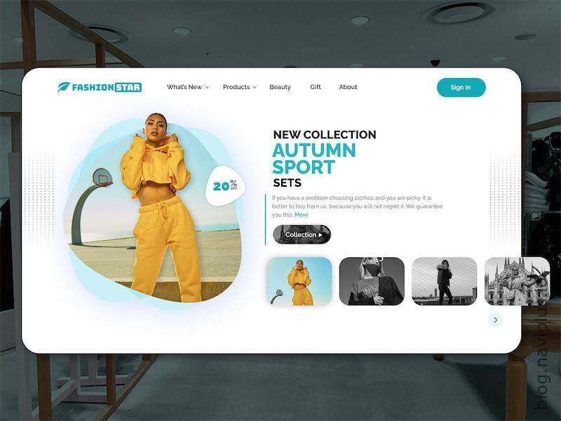
These are the most important principles, ranked from low to high, of what you need to do to improve your Shopify web page design.
Note that just doing one of the following principles well can bring unexpected results. Here are 30 comprehensive principles to consider when designing a Shopify website:
- Understand Your Audience: Before you even begin the designing process, it’s crucial to understand who your target audience is. This includes understanding their age, interests, shopping habits, and what they value in an online shopping experience. This information will allow you to design a Shopify website that caters to their specific needs and preferences, enhancing the likelihood of conversions.
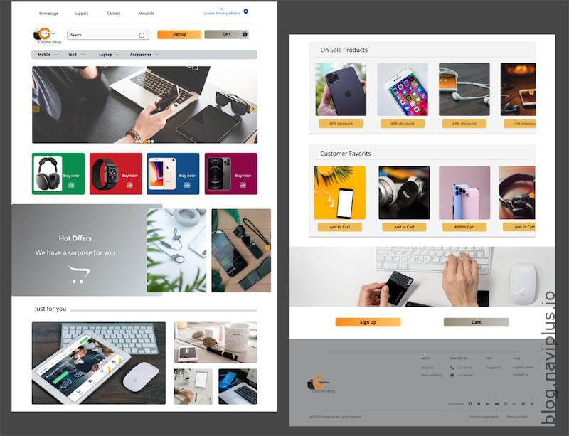
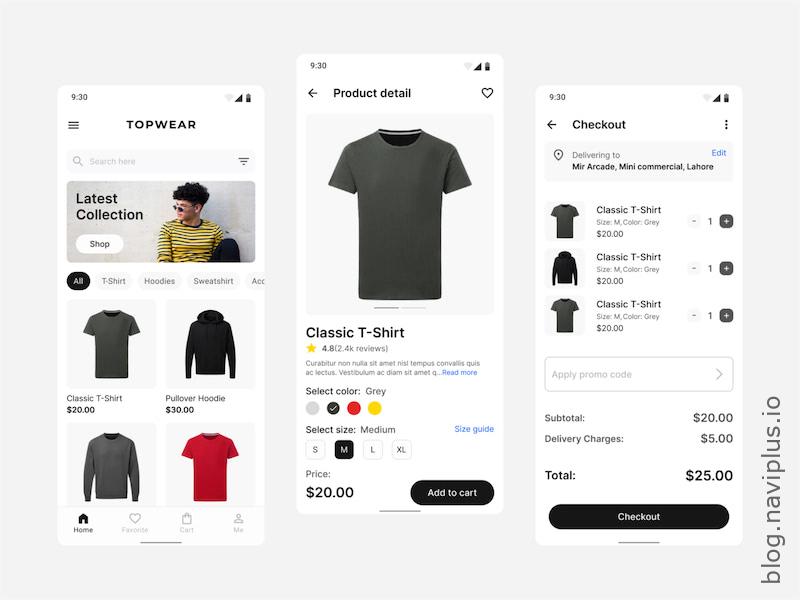
- Mobile-First Design: With the rapid increase in mobile shopping, designing your Shopify website with a mobile-first approach is essential. This means your website should look and function seamlessly on mobile devices, even before considering how it looks on a desktop. This design principle not only ensures that you’re offering a great user experience for all visitors but also can improve your search engine rankings.
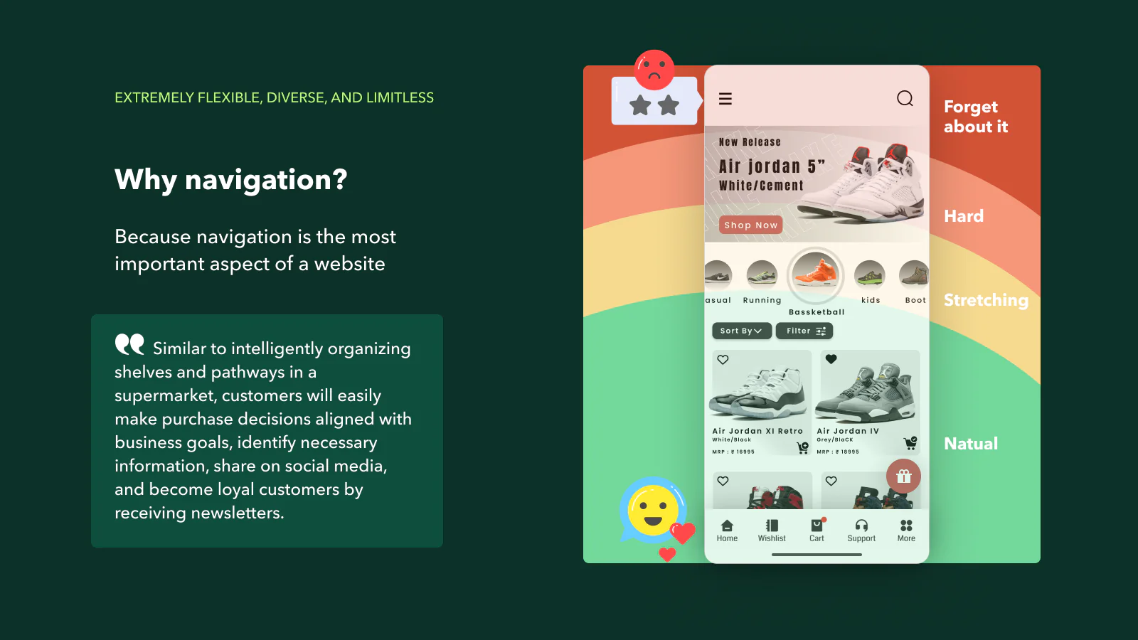
- Shopify Easy Navigation: A Shopify website should be easy for visitors to navigate. This implies that all important sections of your website, like product pages, contact information, and the shopping cart, should be accessible within a few clicks. A site map can be highly beneficial for this purpose. The easier it is for customers to find what they’re looking for, the higher the chances they’ll complete a purchase.
- High-Quality Imagery: High-quality images are crucial for any eCommerce website. They provide the customer with a clear idea of what they’re purchasing since they cannot physically touch or see the product. Use clear, professionally-captured images that highlight your products effectively, and consider adding multiple images for each product to showcase it from different angles.
- Clear Product Descriptions: In addition to high-quality images, your Shopify website should have clear and detailed product descriptions. These descriptions should provide all the necessary information about the product, including its features, benefits, and any other relevant details. This can help customers make informed decisions and reduce the likelihood of returns.
- Fast Loading Speed: A slow-loading website can frustrate users and often leads to high bounce rates. Therefore, it’s important to optimize your Shopify website for speed. This can be achieved by compressing images, minimizing the use of heavy scripts, and using a reliable hosting provider.
- Easy Checkout Process: The checkout process should be as simple and straightforward as possible. The more complex the checkout process, the higher the likelihood of cart abandonment. Ensure that the process is secure and that customers can easily see the total cost, including shipping and taxes, before they finalize their purchase.
- SEO Friendly: Your Shopify website should be designed with SEO in mind. This includes using relevant keywords in your content, optimizing your images, and ensuring your site is easy to navigate. An SEO-friendly website can help increase your visibility on search engines, leading to more organic traffic.
- Include Customer Reviews: Customer reviews are a powerful tool that can build trust and persuade potential customers to purchase. Display these reviews prominently on your product pages and consider including a system for customers to easily leave reviews after their purchase.
- Consistent Branding: Consistency in branding across your website contributes to a professional appearance and helps build trust with customers. Your color scheme, logo, fonts, and overall design should align with your brand identity. This consistency should extend to the tone and style of your content as well.
- Optimize for Conversion: Every element of your Shopify website should be designed with the goal of conversion in mind. This includes strategically-placed call-to-action buttons, enticing product descriptions, and an easy check-out process. Consider running A/B tests to find out what works best for your audience and continually optimize based on the results.
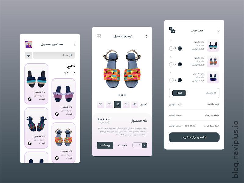
- Leverage Social Proof: Social proof, such as customer reviews and testimonials, can greatly influence a potential customer’s decision to purchase. Highlight these elements on your product pages to enhance trust and credibility.
- Provide Excellent Customer Service: While not strictly a design element, ensuring easy access to customer service can significantly improve user experience. This could be in the form of a live chat, a prominent display of your contact information, or a detailed FAQ section.
- Personalize User Experience: Personalization can make customers feel valued and improve their shopping experience. This could involve showing product recommendations based on browsing history or providing personalized offers.
- Regularly Update Content: Keeping your content fresh and updated is important to keep your audience engaged. This involves regularly updating product descriptions, blog posts, and other content on your website.
- Ensure Website Security: An SSL certificate is crucial to ensure your website is secure. This not only protects your customers’ information but also builds trust as customers feel safe shopping on your website.
- Use High-Quality Product Videos: Product videos can provide a better understanding of your products and convince customers to buy. Ensure these videos are of high quality and accurately represent your products.
- Simple and Clean Design: A cluttered website can be overwhelming for visitors. Stick to a simple and clean design with plenty of white space to make your content stand out.
- Efficient Search Function: An efficient search function can make it easier for customers to find what they’re looking for, improving user experience and increasing the likelihood of a sale.
- Frequent Testing and Feedback: Regularly test your website on various devices and browsers to ensure it’s functioning properly. Gather feedback from users and make necessary adjustments to enhance the shopping experience.
- Cohesive Visual Hierarchy: Visual hierarchy refers to the arrangement and presentation of elements in a way that indicates their importance. This is crucial in guiding visitors through your site and helping them understand what to focus on.
- Intuitive User Interface (UI): The user interface should be intuitive and easy to use. This means buttons should be large enough to click, text should be easy to read, and the overall layout should guide visitors through the site.
- Use of Color Psychology: Colors have a significant impact on our emotions and can influence buying decisions. Use color psychology to your advantage by choosing colors that align with the emotions you want to evoke in your customers. For instance, red is often associated with excitement and passion while blue can create a sense of trust and reliability.
- Accessible for All Users: Make sure your website is accessible to all users, including those with disabilities. This could involve ensuring your website is compatible with screen readers, providing alt text for images, and using sufficient color contrast.
- Effective Use of White Space: White space, or negative space, refers to the empty space around and between the elements of your design. Effective use of white space can make your website look clean and easy to navigate, improving user experience.
- Regular Analytics Review: Regularly review your website analytics to understand how users are interacting with your site. This can provide valuable insights to help you identify areas for improvement.
- Compatibility Across Different Browsers: Your website should function seamlessly across different browsers. Regularly test your website on different browsers to ensure all features work properly.
- Use of Favicon: A favicon, or browser icon, is a small square image that represents your website on browser tabs and bookmark lists. It can help improve brand recognition and user experience.
- Clear Return and Shipping Policies: Clearly state your return and shipping policies on your website. This can help set customer expectations and reduce potential disputes.
- Effective 404 Pages: 404 pages appear when a user tries to access a page on your website that doesn’t exist. Instead of displaying a standard error message, create a custom 404 page that guides users back to a working page on your site.
